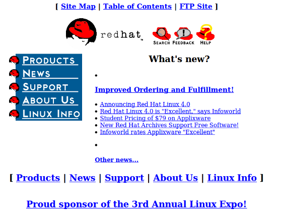
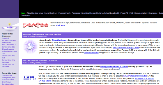
This is how some of the popular Linux distro websites looked like when they launched initially. Thanks to the archive.org for all the screenshots. Redhat website looked pretty decent for a 1996 website. Which one of these websites did you like?
1. Ubuntu.com 2004 Screenshot

2. Debian.org 1997 Screenshot

3. Centos.org 2004 Screenshot

4. Fedora.RedHat.com 2004 Screenshot

5. RedHat.com 1996 Screenshot

6. Archlinux.org 2002 Screenshot

7. OpenSUSE.org 2005 Screenshot

8. Slackware.com 1999 Screenshot

9. Gentoo.org 2002 Screenshot

10. Mandriva.com 1998 Screenshot


 My name is Ramesh Natarajan. I will be posting instruction guides, how-to, troubleshooting tips and tricks on Linux, database, hardware, security and web. My focus is to write articles that will either teach you or help you resolve a problem. Read more about
Comments on this entry are closed.
I remember these so well. And to be honest, slackware.com hasn’t improved or changed much in the last 11 years.
#10 clearly isn’t from 1998, because the Mandriva name change happened in, uh, 2005-2006 IIRC. The ‘News’ link at bottom left shows 2005-dated items.
I liked the Mandriva one the best. Followed by Slackware, RedHat, Fedora, and Gentoo (they were all pretty close in my opinion). Centos looked too much like one of those Domain Parking sites to me.
Have a great day:)
Patrick.
@Adam:
And the mandriva stock price is given in €.
redhat’s first site is not known. (not archieved.) you know why?
cause redhat is born in 1993 (and they had a site already back then, i know i visited also with my dailup modem)
Besides Slackware, I noticed Gentoo’s hasn’t changed much either. Cool profiles, thanks.
Mandriva was not released until 2005 so the date 1998 is a little wrong.
In 2005, MandrakeSoft acquired the assets of Lycoris, and purchased Conectiva. As a result of the forced name change, the name Mandriva was selected to reflect the combination of MandrakeSoft and Conectiva.[4]
@ Patrick Dickey April 7, 2010 at 11:24 am
” Centos looked too much like one of those Domain Parking sites to me.”
LOL!
@Stefan and @Adam,
Mandriva was way ahead of its time 🙂
@ Patrick Dickey
Mate, when I saw your comment, I read the comment I was about to post.
I liked Mandriva’s website the most, and, on CentOS, I was about to say it looked like a stock search webpage. And there’s something geeky but strangely catchy about Slackware’s homepage layout I can’t help but love. Incredible.